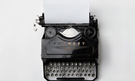
Look at your logo, your business card, your brochure, even your invoice. What fonts are you using?
If you don’t know, find out because fonts influence our interpretations of your messages.
When you don’t have much room to make your point, every word has to work, and the way words look, may mean more than you realize.
Typography is the art of arranging type in order to make language visible. Type design is a closely related craft that we will consider a part of typogrpahy. Crafting different typefaces is used to add emotion to mass communication. In fact, the typeface you use to display your text influences how your words are interpreted.
Non-fiction, fiction, editorials, scientific, spiritual, and commercial writers all experiment with different fonts to tell their stories. Of course, some fonts are more appropriate for use in one work over another as I’m sure Comic Sans is more appropriate for a comic book than an article in Nature magazine.
Seth Godin provided an example of typography’s power in a May blog post titled, Remind you of anything? Simple typography for non-professionals.

“In some situations, some cultures, some usages, one type looks fine and another looks garish or silly or just wrong.” Godin, Seth
Here is a brief and entertaining video introducing us to the history of typography:Â
The gist: as you continue to develop your brand, pause for a moment when selecting a font and ask yourself how this font will influence your reader’s mind.


